
Technology
Basis Platform
Advertising Operating System
Communication Portal
Intelligent Collaboration
All Channel Activation
Activate Media on Every Channel
Consulting
Resources
As a digital marketer, analyzing and unraveling data is a critical part of the game. Aside from defining precisely what you want to track, an increasingly important consideration is how often you plan to review the metrics you’re focused on. And guess what? It’s impossible - and unworkable - to simply throw a blanket over different metrics and treat them all with a single formula. Depending on the model and strategic objectives of a given business, marketing teams need to adopt their own distinct analytical cadences.
For some marketers, that means tracking key performance indicators on a week-over-week basis, as opposed to once per month, or even once a quarter.
The benefits of conducting weekly evaluations are many. Primary among them is that they help you pivot and adjust your campaigns more quickly and keep things on pace to meet monthly goals and benchmarks. Regular performance check-ins allow you to identify specific aspects of your ads - whether that is creative, messaging, or keywords - that are resonating with your audience and then iterate as required on those that clearly aren’t before they drain your budget. You may, for example, have just added a bunch of negative keywords to prevent your ads from showing up on irrelevant searches and in the process damaging your relevance score. Comparing campaign performance for the current week against that of the preceding week helps expose if those alterations had any impact. Similarly, if you increased bids in an attempt to improve your visibility on the search engine results pages, you can track how that affected key metrics including conversions, CPA, ROAS, and Profit. By gleaning this type of information in weekly cycles, you become empowered to design goals that reflect evolving capabilities. Even if you’re running a longer campaign with a slow release of promotional material over the course of a month - say, on social media and your blog - it’s still important to look at your campaign metrics on a weekly basis in order to stay agile and modify your tactics based on near real-time data.
In this blog post, we explore what effective weekly performance analysis looks like using dashboard features complete with real client data.
Overview:
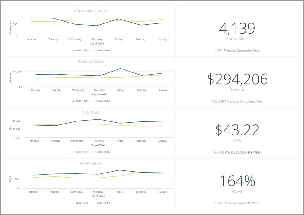
Format: Single Value Tiles and Line Charts
Time Period: Week-Over-Week
Metrics: Impressions, Clicks, Cost, CPC, Conversions, Revenue, CPA, ROAS, RPC, Profit, Conversion Rate, AOV
In this widget, we’re presented with two different views of the same fundamental data points. On the right, we’ve got an easily digestible snapshot of the primary KPIs in aggregate, and then on the left, we can see those numbers broken down by day in a time series line graph. A marketing dashboard should be viewed as a steering wheel for optimum performance and this handy visualization helps you smoothly navigate the digital ecosystem of your industry. Within seconds, you can pinpoint any anomalies and major events and evaluate whether your campaigns are trending according to your forecasts.
We can see from the data showcased here that throughout the previous seven days our client generated revenue of a little over $294K compared to $220K the week prior. That’s a 30% to 35% increase, week-over-week, and something that certainly warrants a more exhaustive investigation into the cause.
A swift glance leftwards at the line graph tells us that the variance came from across the entire week, with one particularly meaningful spike on a single day. Armed with that insight, you can then switch over to more granular dashboards to really dig into what triggered the spike. By observing how your metrics fluctuate daily from a weekly perspective, you eliminate any overhasty conclusions from your analysis and avoid latching onto false signals that could easily result in a misallocation of funds.
Overview:
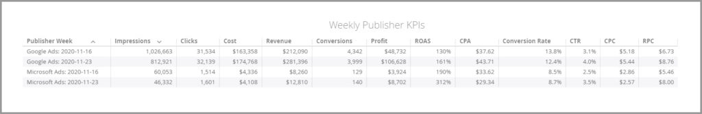
Format: Table
Time Period: Week-Over-Week
Metrics: Impressions, Clicks, Cost, Revenue, Conversions, Profit, ROAS, CPA, Conversion Rate, CTR, CPC, and RPC
As all digital marketers will attest, campaign performance typically varies widely by segment, whether that be by channel, publisher, or any other dimension you’re working with. Once you’ve learned about the state of your program at a very high-level from the charts above, you can then dive deeper into some selective elements.
We can see, for example, that the upturn in revenue was across both Google and Bing despite fewer impressions, a negligible difference in clicks, and incredibly, in the case of Google, far fewer conversions week-over-week. It’s also worth noting that Bing is doing a great job at complementing this particular client’s PPC strategy, bringing in the conversions at a much lower CPA and significantly higher ROAS than Google. Such insights are extremely valuable because they help you continuously optimize your initiatives, exploit previously unforeseen pockets of improvement, and reshape the strategy behind how you’re distributing your marketing dollars to reach your end-of-month - and yearly - objectives.
Overview:
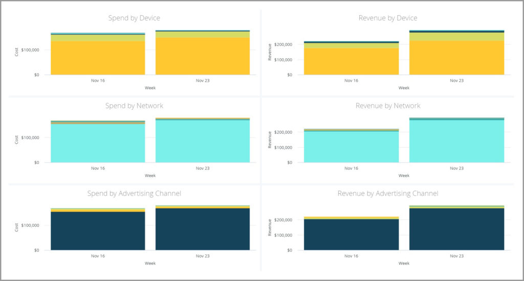
Format: Stacked Bar Charts
Time Period: Week-Over-Week
Metrics: Spend and Revenue
Completing this dashboard look, we have a series of stacked bar charts depicting further granular visualizations of spend and revenue. With marketing campaigns continuing to grow in their complexity as more data, channels, and tools become available to advertisers, the main purpose of this widget is to help you simultaneously compare totals and determine which sharp changes at the item level are likely to have had the most influence on the movements we saw in the components above.
As marketers, we’re tasked with making crucial monetary decisions on behalf of the company every day. By tracking this type of information weekly, you can get a sense of whether a particular device, network, or advertising channel is performing better or more poorly than expected fairly quickly, ultimately empowering you to either pause or invest more heavily in ads where appropriate.
The cycle of experimenting, measuring, and optimizing is rigorous and never-ending. What automated weekly reporting does is provide the actionable insights you need to form better hypotheses and drive accelerated growth by connecting effort with outcome at both micro and macro levels.
Once you have that capability at your fingertips, you can pinpoint market trends like never before and outpace your competitors absolutely everywhere.
~
Our universal reporting and analytics technology is instrumental in driving consistent growth for marketing teams large and small. See for yourself how powerful it can be.