In this post, we’ll be delving into why you should always be segmenting and evaluating your data as often as possible. We’ll share a few examples and common errors in the process.
Why Should I Bother Segmenting Data?
Most decisions pertaining to PPC are based on data relating to different metrics. For example: if devices are showing contrasting performance, you’ll want to use Mobile and Desktop device modifiers.
Normally, you can rely on Google Enhanced bidding and Google Smart bidding to make most of these decisions, but there are many scenarios where this may not be an option for you. If you have a SEM bidding optimization tool, you can use the segmentation in your favor, but if that’s not the case, then it will always be useful to know some basic rules about how to understand your data.
A Few Key Analyses for Your PPC Program
With the amount of data flying around marketing campaigns in the modern age, it can be difficult to know where to start. Here are a few ideas about how to break up your data in order to be able to make sense of it. Whether you’re evaluating a significant change, troubleshooting underperforming segments, or simply doing an A/B test, be sure to keep these two frameworks in mind:
1) Always check the trend
For any performance evaluation, it’s clear that data will vary over time depending on recent changes and trends. Below we have two data sets with vastly different behavior.
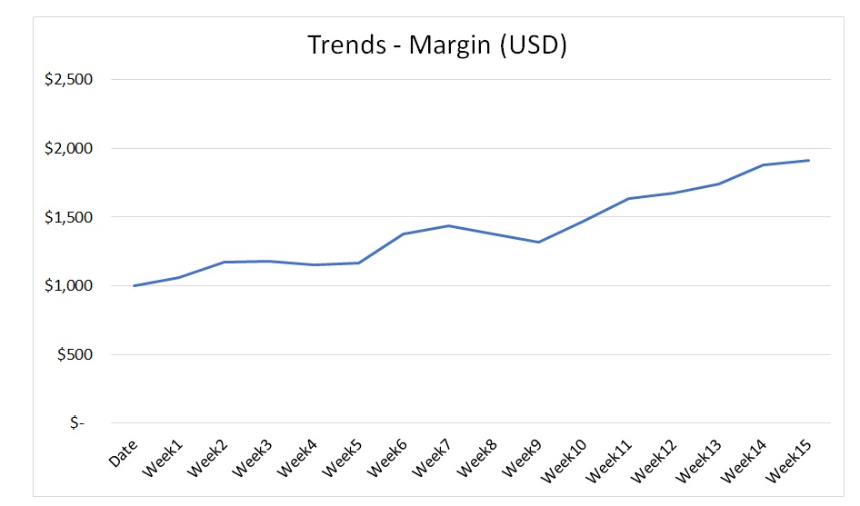
First, let’s take a look at this chart. We’re plotting the profits of a campaign over time and analyzing its evolution. There appears to be a healthy growth at a steady rate over the entire 16-week period:
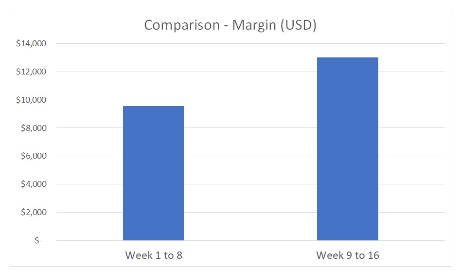
If we break this down into months and do a comparison of the profit realized in the first two months versus the last two, we would report that profit throughout the campaign grew 136% period over period:
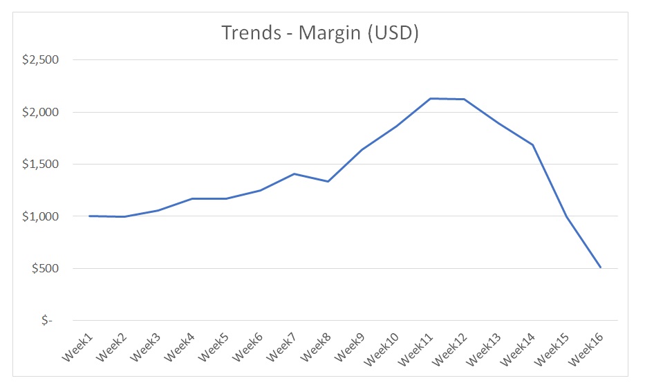
Now, let’s assume this campaign had a different result. After having two solid months, the campaign started to suffer some changes. Around week 10, what seems to be a dramatic increase in profit preceded a drastic collapse:
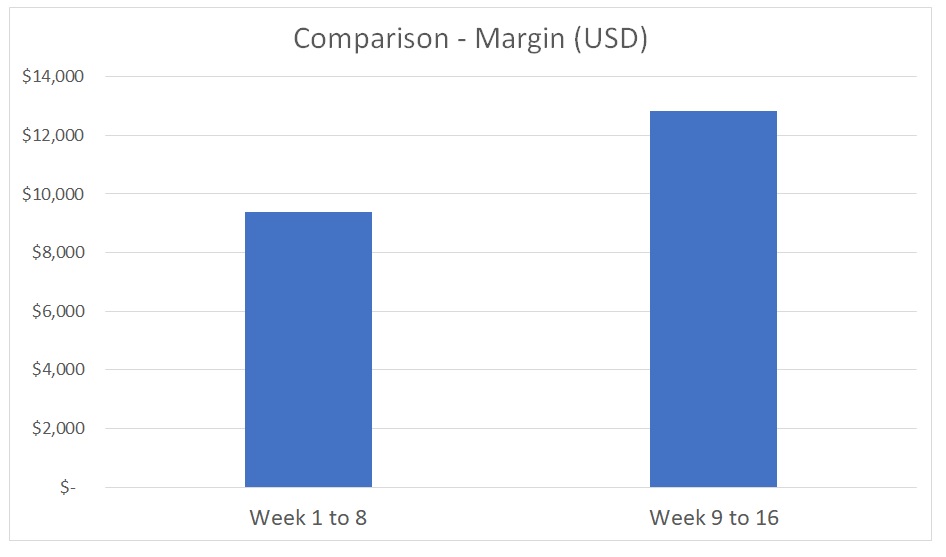
If we evaluate the high-level picture of this data set and we repeat the same report, we will see the following comparison:
The campaign once again shows a rise in profit period over period. It further reports a 1% lift—137%—compared to the previous example.
In both cases, then, profit grew by more than 35%. The period versus period charts show identical performance. If we dive into trends and behaviors, though, we see two very different scenarios. The first showed solid and steady growth, while the second indicates that performance worsened severely and there is an underlying issue that requires immediate attention. Remember to always look at trends when assessing performance evolution.
2) Always Check the Relationship Between Metrics
There are times where you would evaluate a variable against another variable. A typical SEM case for this is plotting the relationship between volume and efficiency—for example, by comparing Revenue (in dollars) and ROAS (in percentage). These analyses are very useful when looking to verify a correlation or when we want to understand how two metrics are connected.
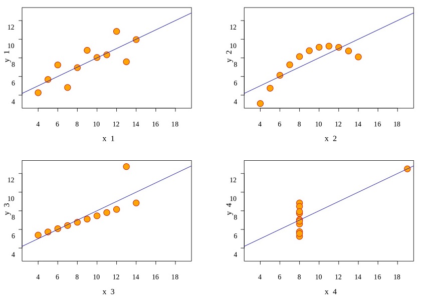
Below, we will plot four different data sets, each of them containing the same number of observations:
A quick scan of them reveals that these four charts have no connection at all. Data Set 1 has a simple linear relationship between metrics; Data Set 2 has a non-linear correlation between metrics; Data Set 3 is an almost perfect linear correlation; and Data Set 4 appears not to have any identifiable relationship.
These four charts probably describe four different metrics and behaviors. However, if we pull out the main KPIs for these data sets, we will always get the following for all four cases:
The median (average) of X is 9
The median (average) of Y is 7
The linear regression trend is 0.5
Pearson correlation coefficient is 0.816
This example shows the importance of always looking at the data graphically before jumping into performance conclusions, metrics, and interpretations. This exercise was developed in 1973 by the statistician Francis Anscombe and is called the ‘Anscombe’s quartet’ (and yes, this could well be the name of a folk band).
Final Takeways
Understanding your data can be challenging, and adopting the right approach to it will save you time and will help your decision-making process. We can always trust KPIs and metrics, as long as this is reinforced by a thorough process of data interpretation. Segmenting your data graphically is a key tool that will help you in the process.